
Why Multiple Styles?
Breadth makes you a better letterer
Learning one script in isolation can create habits that are hard to break. When you study multiple hand styles in sequence, you build a more complete understanding of how letterforms work, why different tools produce different results, and what it actually means to write with intention.
The curriculum is ordered deliberately. It opens with scripts that teach foundational stroke control, then moves into styles that require more nuanced pressure and angle. By the time you reach the later modules, the earlier ones have already given you the physical foundation to handle them.
The Five Modules
Hand styles covered in the curriculum
Italic Calligraphy
Renaissance Europe
Italic is where the course begins. It uses a broad-edged nib and emphasizes consistent letter slope, spacing, and rhythm. The letterforms are legible and relatively forgiving for beginners, which makes it an ideal starting point for developing the muscle memory that every other style depends on.
Copperplate (Engrosser's Script)
18th Century England
Copperplate is a pointed-pen script known for its hairline upstrokes and thick downstrokes. The contrast between thin and thick lines is achieved through pressure variation rather than nib width. Students learn to control the flex of a pointed nib, which requires patience but produces deeply satisfying results.
Uncial
Early Medieval Manuscripts
Uncial is a rounded, open script with roots in early Christian manuscripts. It has a warmth to it that italic and copperplate don't. The letterforms are majuscule-based and written with a broad nib held nearly flat. It's a wonderful change of pace after the precision of Copperplate.
Blackletter (Gothic)
Medieval Western Europe
Blackletter is dense, angular, and instantly recognizable. It uses a broad-edged nib at a steep angle to create the characteristic thick verticals and dramatic hairline diagonals. Students work through Textura Quadrata letterforms, learning how the geometric constraints of the style create its visual weight.
Modern Pointed Pen
Contemporary Practice
The final module moves into modern lettering conventions that draw on the earlier styles but use them more freely. Students explore how contemporary calligraphers adapt traditional scripts, introduce variation, and develop a personal voice within learned structures. This module requires the full foundation the earlier four have built.
The Workbook
How the printed workbook supports each style
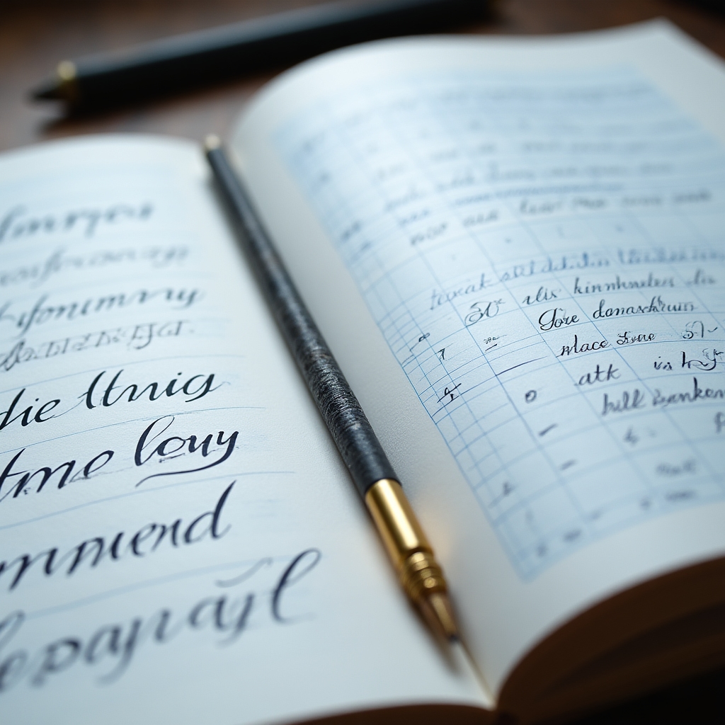
Each module in the curriculum has its own workbook section. You'll find letter guides at the correct angle and proportion for that style, warm-up exercises to do before writing full letters, and structured practice pages that take you from individual letters to words to short passages.
The workbook is printed, not digital. There's good reason for this. Practicing calligraphy on a screen is not calligraphy. Having a book in front of you while you work — one that's designed to be written in and marked up — keeps you anchored in the physical practice that actually builds the skill.
View Course OptionsReady to Start?